Saturday, November 14, 2015
Lights! Color! Action!
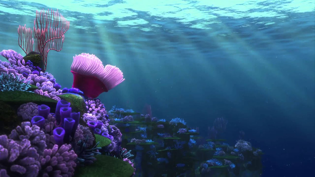
Yes, I definitely did post another Pixar reference because you know what? I really, really, love this movie and how well it was made. Also, it displays a perfect example of what I'm going to be talking about. Lighting and color is a whole different monste--uh, subject in animation. It's an extremely important one nonetheless even if it doesn't get a whole lot of recognition. It's also something I'm not very well informed about, but I do know some of the general aspects to it.
Color and lighting deals with contrast, hues, tones, and color palettes to enhance scenes in the movie. It's all about emotional appeal. Depending on the genre of the scene, these techniques are used to make it come to life in the eyes of the viewer. It makes it look more naturalistic. If the scene is more dramatic then there is a lot of contrast with both colors and lighting; the light could darken until bright eyes are the only thing seen in the background. If it's a comedy scene then brighter colors are used and a natural light bright enough to capture the scene is used. Again, it depends on the genre of the scene and setting it to that mood.
In animated movies, a color script is used throughout the entire movie and a schema coincides with emotional beats and to the story arc. I've seen several color scripts from Pixar to DreamWorks and it's very impressive how they know which colors to use and what kind of lighting sets the attitude. I saw a documentary on the making of Finding Nemo and the way they charted the lighting and colors for underwater is phenomenal. They did a LOT of studying for this film. I can't imagine it being easy to try to make the underwater world look as realistic as possible. They went scuba diving in the ocean in order to chart how the light filters through the water and how underwater looks during the day, evening, and at night. I recommend watching the process on YouTube because it was freaking amazing how they did it.
For TV shows, I am actually not quite sure if they use color scripts, but I imagine they use something like it in order for them to set moods and everything. A lot of shows do a really good job on this, too. The art director for the TV show, Gravity Falls, does an excellent job conveying color schemes of the forest and how the light filters in through the trees. I'll be talking more about that show later, for sure. All you really need to know is that the colors and lighting for movies and shows are there to convey the mood of each scene and to capture the attention of the audience. It's just more ice cream on top of that delicious apple pie. I apologize, I always get hungry around this time.
Next topic is finally the one I've been waiting for and can't wait to talk about: Storyboarding!
Subscribe to:
Post Comments (Atom)

No comments:
Post a Comment